
It is said that history repeats itself. So, why don’t we use historic data to figure out where we might be headed? Are we due for a recession? What does your gut say? Let’s see if you are right. For the past 10 years, the US Economy has been running like a strong machine, but my goal for this blog post is to give you an idea of what might be ahead. In this blog post, I will be analyzing 3 graphs: Unemployment data, Treasury Yield and Effective Federal Funds Rate, and Stock Market Capitalization to GDP. Let’s begin!
1. Unemployment Data
There has been a relationship between unemployment data and recessions. Looking at the unemployment insurance weekly claims graph below, we can see that right when unemployment was at its lowest, a recession was right around the corner. 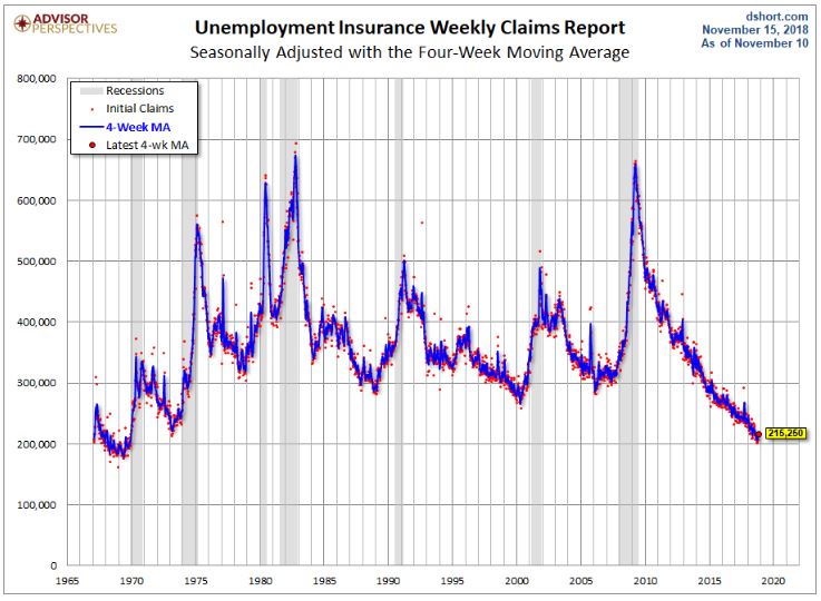 The shaded out gray areas are the times of recessions, which are evident by the spike up in the unemployment insurance claims. The recent unemployment numbers are at a 40 year low. Do you think the unemployment rate is going to keep dropping, or are we set for another spike up?
2. Treasury Yield and Effective Federal Funds Rate
Treasury Yield is the return on investment on the US Government’s debt obligations. In other words, treasury yields are the interest rates that you get on the 3 month, 2 year, 5 year, 10 year, 20 year, and 30 year government securities (bonds, notes, or bills). Federal Funds Rate (FFR) is the interest rate that banks charge each other when one bank wants to borrow from another bank. The Federal Reserve influences the FFR by increasing (expansion) or decreasing (contraction) the money supply, which pushes interest rates lower or higher respectively. In other words, FFR goes hand in hand with the interest rates. In this graph below, we can see the different bond yields in relation to the FFR. 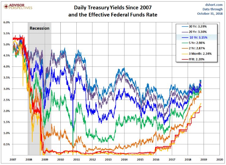 It is important to note that right before the recession, the Treasury Yields and the FFR were all concentrated between 4.0% and 4.5%. During the recession, the Federal Reserve lowered the interest rate and injected more money into the system. This led to an expansion and economic growth. After 2016, the Federal Reserve started to tighten again i.e. increase interest rates and stop the injection of money. Consequently, we can see the FFR increase. Furthermore, the Treasury Yields and the FFR have started to get closer to each other again. I predict that it might be a year or two before the Treasury Yields and FFR are within 0.5% of each other. Do you think we will be set for another recession at that point? We know that as the Federal Reserve starts to contract the money supply, the economic growth slows. It is simply a matter of time until that contraction leads to a recession. The question is how far away is that recession?
3. Market Cap to GDP Ratio
Back in 2001, Warren Buffett said in an interview that Market Cap to GDP is the best single measure of where valuations stand at any given moment. As a disciple of Warren Buffett, I have to make sure that I bring this ratio to your attention. The numerator is the market value of equities outstanding, which is the number that appears on line 41 in B.103 Balance Sheet available on the Federal Reserve website. The denominator used for the chart below is the Q3 advanced estimate of the nominal quarterly GDP. Market Cap to GDP Ratio is used to determine if the overall market is under or overvalued compared to a historical average.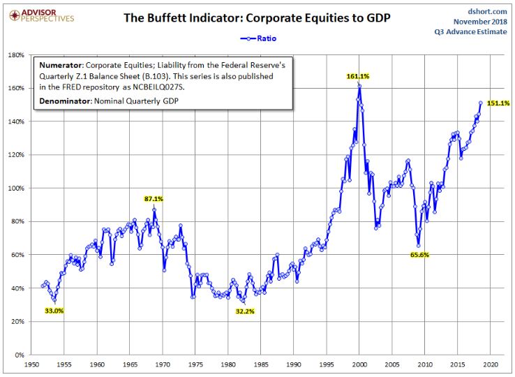 As we can see from the graph above, the valuation of the current market has surpassed that of the pre-2007 financial crisis valuation. In fact, we are quickly approaching the valuation level that market had during the dot-com bubble of 2000. It is safe to say that the current stock market is overvalued.
Looking at all these three graphs, it is evident that the United States is in an aging bull market. The US Economy and the stock market has had a good run this past decade. However, with the increase in interest rates, the contraction has begun. How much longer do you think this bull market can go? Unfortunately, timing the market is not my forte. If history repeats itself, it is simply a matter of time before these graphs change direction. Will it be 6 months, 2 years, or 5 years? I do not know. My goal was to give you an idea of how far we have come since the previous market crash, and where we might be headed.

Hope you learned a little and found this blog post helpful. We talked about Unemployment Data, Treasury Yields and Federal Funds Rate, and Market Cap to GDP ratio to help you gain a better understanding of what might be in the near future for the US Economy. As always, you can sign up for our mailing list here. Like us on our Facebook page here. Thank you! Note: The graphs used in this blog post were taken from DShort’s website.


Email us at: superiornorthllc@gmail.com
Superior North LLC’s content is for educational purposes only. The calculators, videos, graphs, recommendations and general investment ideas are not to be actioned with real money. Contact a professional and certified financial advisor before making any financial decisions.
